Sadie Chandler
The Rules
House Rules book
Buildings
Framework
Art History
The Factory
Wallpaper
City Life
Portraits
Houses
About
Instagram
©Sadie Chandler
Notes on my work
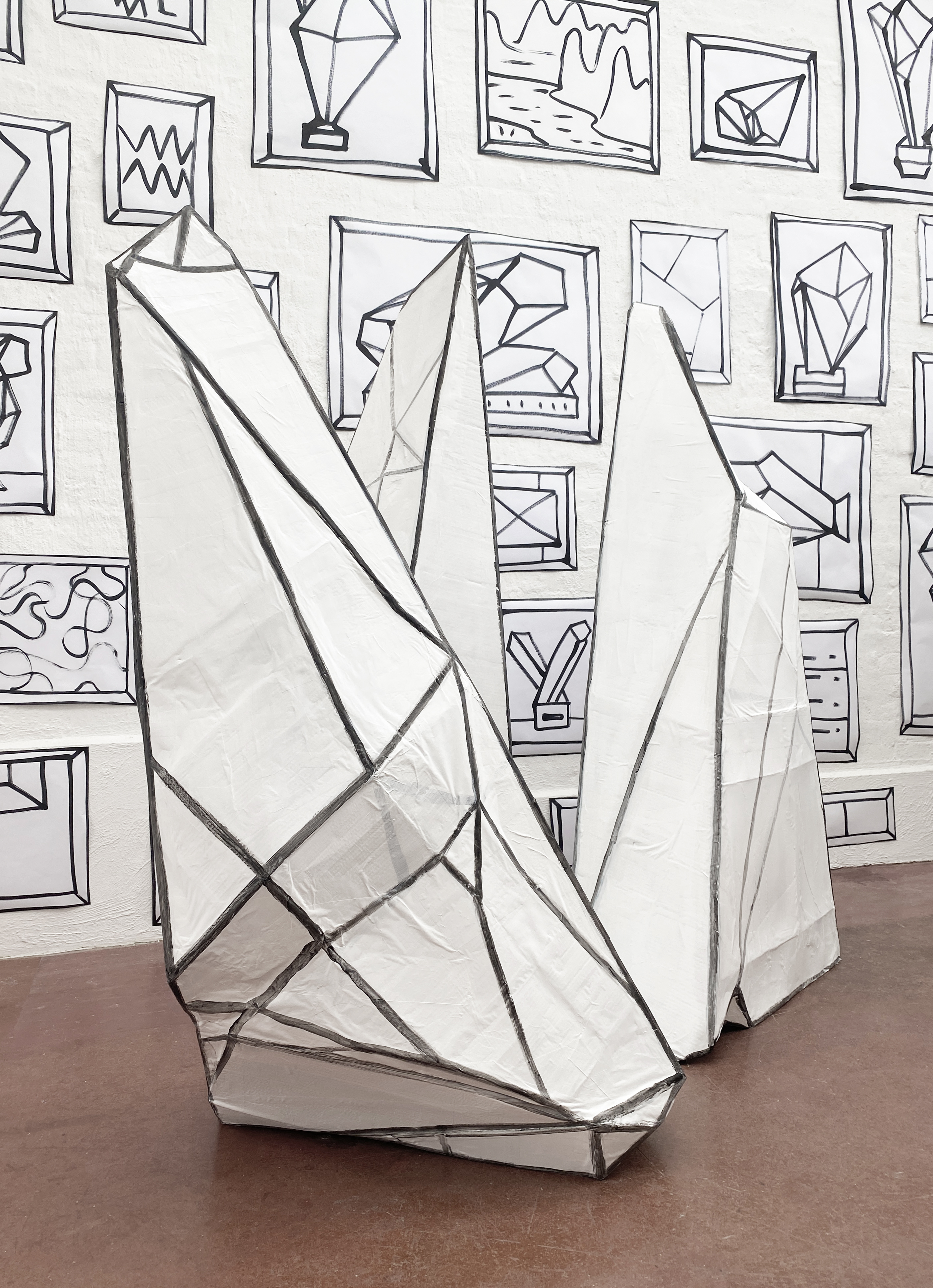 Sadie Chandler, Crystals, 2024, ink and acrylic on cardboard and paper
My work usually involves painting and installation. It can be abstract and figurative. No matter what medium or form, my approach is that of a painter, aware of the limitations of painting and its history. When I consider the projects I’ve done over the years, I think about how they fit together. How, for instance, the abstract Spray Paintings series relates to the Pin-up Girls or the Factorywork series and the various connections between these different projects.
I make wallpapers, paintings and occasionally objects based on what I see around me; cities, factories, cars, houses, things in the media and in museums; pin-up girls, portraiture and landscape images. There is a similarity of style in all of my works. I use a heavy line and flat areas of colour and there’s no attempt at realism. Indeed, it’s often described as cartoon-like. I tend to draw in a graphic way using outlines, without realistic shading or perspective.
In some ways, I have a fairly traditional practice, because I’m caught up in art history. My studio practice could also be regarded as traditional because I don’t outsource any of my production and my work is mostly made of oil on canvas or ink on paper. I like to use old-school materials rather than new technologies and prefer the solitary studio life to running around to printing labs or getting other people involved. My work plays with the idea of the unique and creative production of the artist in the age of digital reproduction.
I’m interested in how images work, how we see them through the inescapable trap of art history. Iconic works of art in museums are already known before we see them in the flesh, so we’re always stuck with embedded memories of them. As an artist, it’s impossible for me to forget all the images that have come before the ones that I make. I’m aware of being trapped but also propelled by these images and histories.
Accumulations – Collections
There is a sense of accumulation and layering in my work, where the imaginable parts can go on forever. My wallpaper works might appear to be mass-produced, like something found at a hardware shop. In fact, they are made of a huge number of hand-made original drawings. Hundreds of individual ink-on-paper drawings are pasted over entire wall surfaces from floor to ceiling and from edge to edge. These original ink drawings are one-offs and not printed, as they might first appear. I like the way these works can be very big, yet made with minimal use of materials — basically just pen on paper. At the same time, they are discreet because they are part of the background — they take up no space and there is no central part of the work that demands attention.
The wallpaper works are usually drawn with a black, extra wide, felt-tipped ink marker pen on regular white bond paper and then cut out and pasted flat to the wall. Afterwards they disappear — there is no storage problem. Sometimes they stay in place for years and sometimes just for a few weeks before they are steamed off the wall and turned to pulp. The Weight of Images, 2017, is a wallpaper work made with hundreds of ink-on-paper sketches, based mostly on iconic pre-modernist works of art that I’ve come across and studied. I’ve spent years looking at collections in musuems, thinking about how we’re caught in a circuit of image reception and reproduction. Generation after generation gets to look at the same old stuff. It’s impossible not to be influenced by these selections and presentations.
This wallpaper work is like a filing system or archive of all the works from all the museums all at once — a massive and immersive collection. The eye wanders from one image to the next as if the whole of the history of art could be there, coded and compressed, icons reinvented as signs. In a way, that’s how the images are stored in my mind. I can recall them without much detail, just the outlines of their general components as economical thumbnail sketches.
In making these studies, I’m engrossed in them for a few intense minutes and then move on to the next, not focusing for long on a particular study — as if playing the role of the tourist, moving through collections of ‘great’ art works, immersed in the context of the museum and its arrangement of objects and images, including plinths and frames in grand crowded galleries. This experience of the spectacle informs my work.
The quick studies that make up the wallpaper in The Weight of Images are examinations that reveal what is almost too difficult to see when standing in front of an original in a crowded museum. It’s often easier to see the details of artworks by looking at them as photos or on the computer screen than it is to see when looking at the real thing. In earlier works such as Lost Portrait Collection, 1996, and Decorator, 1993, I made photos of historical portrait paintings, taken with a flash so that the flare of the camera erased the faces in the paintings, leaving only the frame and the details of the sitters’ clothing visible.
When visiting historical collections in museums, I’m often drawn to portraits. I’m not usually interested in the individual person as the subject in any particular portrait painting. Instead, I’m fascinated by the genre and the formality of the pose, the protocols of gesture and costume. These details are often more telling than the face. I like to look at a portrait as a collection of parts that surround the sitter such as the objects and accoutrements that relate to the sitter. I’m interested in the way portraits hang in halls as framed collections of important dead people and the effect of the uncanny, when the inanimate painting ‘looks back’. My portraits don’t refer to any particular person, as they would normally in paintings of that genre. Rather they are representations of the genre itself, not images of individuals.
Things by themselves
Some of my work is made of singular images of objects or figures, rather than masses of them, such as the Pin-up Girl paintings, where I use singular isolated images in flat space. In these works, I’m interested in the hyper-obsessive way that women are looked at — all the time, over and over. From the naked muse of antiquity and the reclining nude of French neo-classicism to the bikini billboards in shopping malls, images of idealised female beauty persist everywhere.
In 1999, I started a series of paintings of larger-than-life pin-up girls as witches in bikinis. They are alluring, posing as classical beauties, except they have green hair and long noses and are portrayed with heavy cartoon outlines. They refer to the familiar pose of the passive muse, seductive and coy, in their exaggerated and fake femininity. They are larger-than-life-sized female figures — beautiful and ugly, attractive and awful, iconic on their monochromatic backgrounds and, in a way, more ‘real’ than the cartoon style might suggest.
The Dolls House paintings, like the Pin-up Girl paintings, are of a singular image in a flat field. In these works, the cute houses have blackened windows. They are isolated and empty, and like the female figures, they are impossible models for an ideal life.
Flatness
In much of my work there is a certain use of space that is flattened. It’s more like writing with pen on a blank page, or the-perspectival picture plane seen in landscapes in Chinese scroll paintings. Or even in some Aboriginal landscape paintings, where elements can be painted one above the other on the flat plane of a painting’s surface, unlike Western paintings, which usually allude to a horizon and have elements placed in diminishing scale based on geometrical perspective. I tend not to use perspective and my negative spaces are left empty. My approach is informed by the flattened and multiple viewpoints of synthetic cubism and the modernist preoccupation with the grid, as well as being steeped in minimalism and other traditions of painting. Often my works deal with the problems of painting and representation, with collections of dissembled parts laid out on a flat surface. Whether I’m painting figures, or a still life or a landscape, for instance, the main problem for me is how that translates onto the flatness of my canvas or wall.
The Numbers and Spray Painting series are not figurative but they are, like much of my work, always based on an arrangement of objects, signs, or marks on a flat field with little illusionistic space. The Spray Paintings of 2014 - 2015 are made with spots from squirts of enamel spray paint on a monochromatic canvas surface. These large paintings are one of the most abstract looking series I’ve made. In these works there are no objects or figures, but rather just the paint itself that is dotted across the canvas field. Enamel paint has its own rules. I like the idea of letting the paint do what it wants to do and having limited control over detail. It’s concise, economical and fast.
The Numbers wallpapers and paintings are similar to the Spray Paintings, in that they could suggest points on a lateral field. In the Numbers works, single digits hover, floating in flat monochromatic colour like co-ordinates in space. I like the way that these numbers could spring into action as characters that can do mathematical tricks when used in equations and technologies.
The Factorywork series of 2017 includes paintings and hand-drawn wallpaper of cities, buildings and factories. Smoke stacks and machine parts connect and twist, joining more buildings. These linked paintings are installed on top of wallpaper drawn with black ink marker using the same imagery: more buildings and factories, creating a potentially endless layering of images of construction and civilisation. There is no repetition; the individual bits of buildings are different but form a continuity that makes the fabric of the city. They are inspired by post-industrial landscapes, modern cities and a crowded future plane. They also refer to a kind of weaving, where the all-over detail meshes together, connecting bits like computer chips on a motherboard.
The painted factory/cities in these works are of accumulations of layered buildings on top of one another, arranged on a plane devoid of nature — no hills and no rivers, no ground. The hazy, muted colours are soft and fleshy, a suggestion that the city is somehow bodily, yet there are no signs of life. The buildings are organised in a flat grid rather than ordered by illusion of natural geography or perspective.